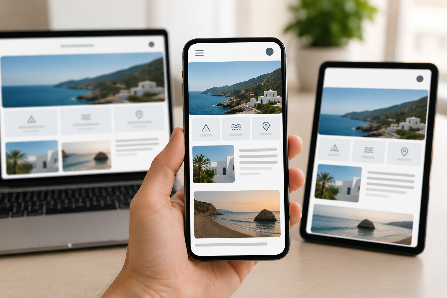
Responsive web design improves user experience on mobile devices by making websites automatically adjust to different screen sizes, orientations, and resolutions. Instead of displaying the same desktop layout on every device, a responsive website reorganizes its content and design elements to fit smaller screens more effectively. This helps users access information comfortably without needing to zoom in, scroll sideways, or struggle with navigation.
One of the biggest improvements responsive design provides is better readability. Text automatically scales to an appropriate size, images resize correctly, and content sections align properly on mobile screens. This allows users to read articles, browse products, or access information more easily. A mobile-friendly layout also ensures that buttons and menus are large enough to tap accurately with fingers, reducing frustration and navigation errors.
Responsive web design also helps improve website navigation. On smaller devices, menus are often simplified into mobile-friendly formats such as dropdown menus or hamburger icons. This keeps the interface clean while still allowing users to quickly find the pages or information they need. Easy navigation is especially important because mobile users often browse websites while traveling, multitasking, or using limited screen space.
Another important benefit is faster loading performance. Responsive websites are commonly optimized for mobile devices by using flexible images, compressed files, and efficient coding techniques. Faster loading times improve user satisfaction because mobile users generally expect websites to open quickly. Slow-loading pages can lead to higher bounce rates, where users leave the website before interacting with the content.
Responsive design also creates consistency across devices. Users may switch between smartphones, tablets, and desktops while browsing the same website. A responsive design maintains a similar visual style and functionality across all platforms, helping users feel familiar with the website regardless of the device they use. Consistency builds trust and makes the browsing experience smoother.
Accessibility is another area where responsive web design improves user experience. Responsive layouts often support better spacing, scalable fonts, and touch-friendly interactions, making websites easier to use for people with different abilities or accessibility needs. This helps websites reach a wider audience and provide a more inclusive browsing experience.
In addition, responsive design supports modern browsing habits. Many users now rely on smartphones as their primary device for internet access, online shopping, reading news, watching videos, and searching for services. A responsive website ensures that content remains functional and visually appealing even on smaller screens, which is essential for maintaining engagement and usability.
Overall, responsive web design improves user experience on mobile devices by providing better readability, easier navigation, faster performance, consistent layouts, and improved accessibility. It allows websites to adapt smoothly to different devices and helps users interact with content more comfortably and efficiently in today’s mobile-driven digital environment.